Free stuff from 3dtotal
This is where you can find and download from our growing library of free stuff! You can use this to get an idea of what you'll find in our printed books, access eBooks, out-of-print books and magazines, or, if you're a new artist looking for some tips and tricks, then we hope you'll find the content here a good place to start!
Latest free stuff
-
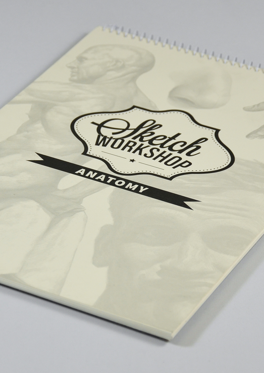
Sketch Workshop: Anatomy (Downloadable Edition)
Regular price Free!Regular priceUnit price per£0.00 GBPSale price Free! -
GRAPHITE Issue 06 (Downloadable Edition)
Regular price Free!Regular priceUnit price per -
GRAPHITE Issue 05 (Downloadable Edition)
Regular price Free!Regular priceUnit price per


All of our free offerings
Filter by interest:
-
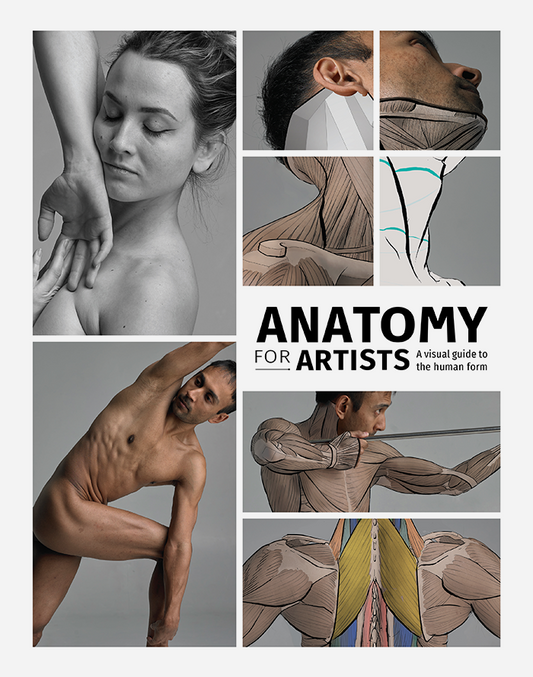
Anatomy for Artists - SAMPLE (Download Only)
Regular price Free!Regular priceUnit price per -
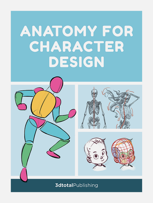
Anatomy for Character Design (Download Only)
Regular price Free!Regular priceUnit price per -
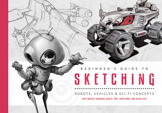
Beginner's Guide to Sketching - FREE CHAPTER 01 (Download Only)
Regular price Free!Regular priceUnit price per -
Beginner's Guide to Sketching - FREE CHAPTER 02 (Download Only)
Regular price Free!Regular priceUnit price per -
Beginner's Guide to Sketching - FREE CHAPTER 03 (Download Only)
Regular price Free!Regular priceUnit price per -
Beginner's Guide to Sketching - FREE CHAPTER 04 (Download Only)
Regular price Free!Regular priceUnit price per -
Beginner's Guide to Sketching - FREE CHAPTER 05 (Download Only)
Regular price Free!Regular priceUnit price per -
Beginner's Guide to Sketching - FREE CHAPTER 06 (Download Only)
Regular price Free!Regular priceUnit price per -
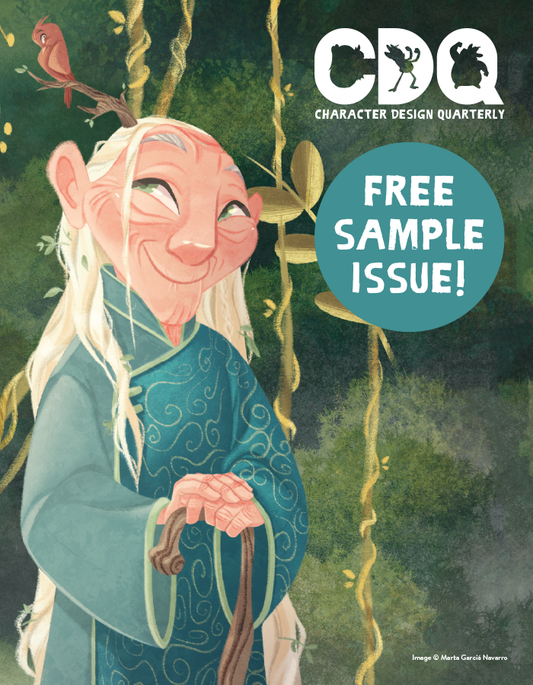
Character Design Quarterly - Sample Issue 2019 (Download Only)
Regular price Free!Regular priceUnit price per -
Character Design Quarterly - Sample Issue 2021 (Download Only)
Regular price Free!Regular priceUnit price per -
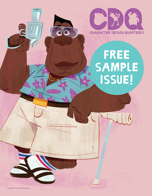
Character Design Quarterly - Sample Issue 2023 (Download Only)
Regular price Free!Regular priceUnit price per -
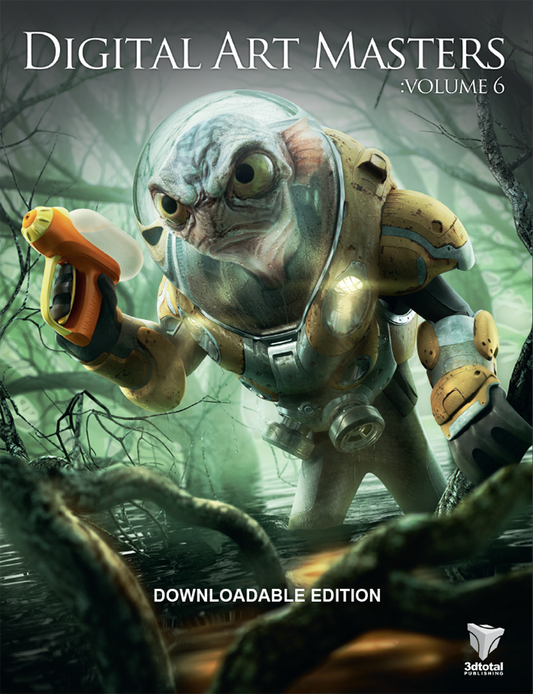
Digital Art Masters: Volume 6 (Downloadable Edition)
Regular price Free!Regular priceUnit price per -
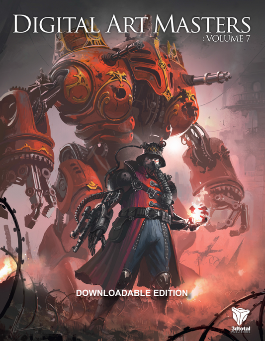
Digital Art Masters: Volume 7 (Downloadable Edition)
Regular price Free!Regular priceUnit price per -
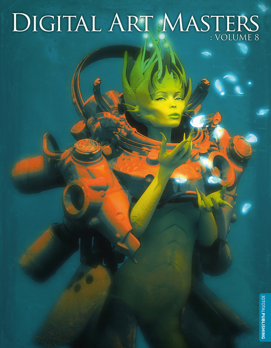
Digital Art Masters: Volume 8 (Downloadable Edition)
Regular price Free!Regular priceUnit price per£0.00 GBPSale price Free! -
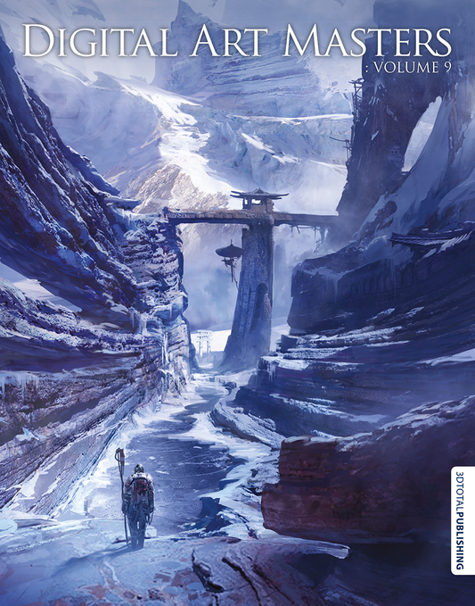
Digital Art Masters: Volume 9 (Downloadable Edition)
Regular price Free!Regular priceUnit price per -
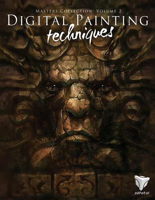
Digital Painting Techniques: Volume 2 (Downloadable Edition)
Regular price Free!Regular priceUnit price per£0.00 GBPSale price Free! -
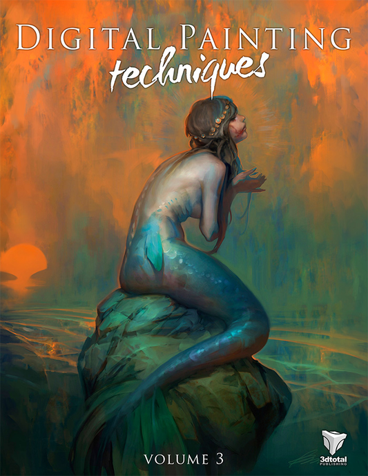
Digital Painting Techniques: Volume 3 (Downloadable Edition)
Regular price Free!Regular priceUnit price per£0.00 GBPSale price Free! -
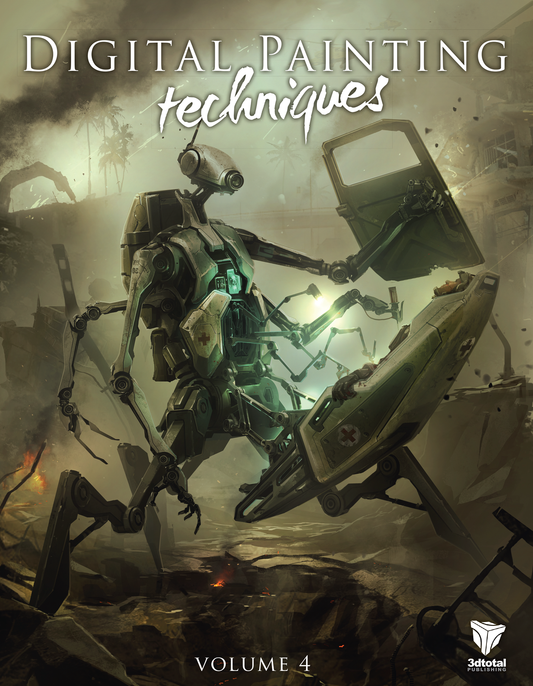
Digital Painting Techniques: Volume 4 (Downloadable Edition)
Regular price Free!Regular priceUnit price per -
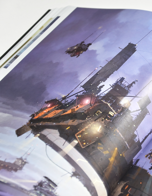
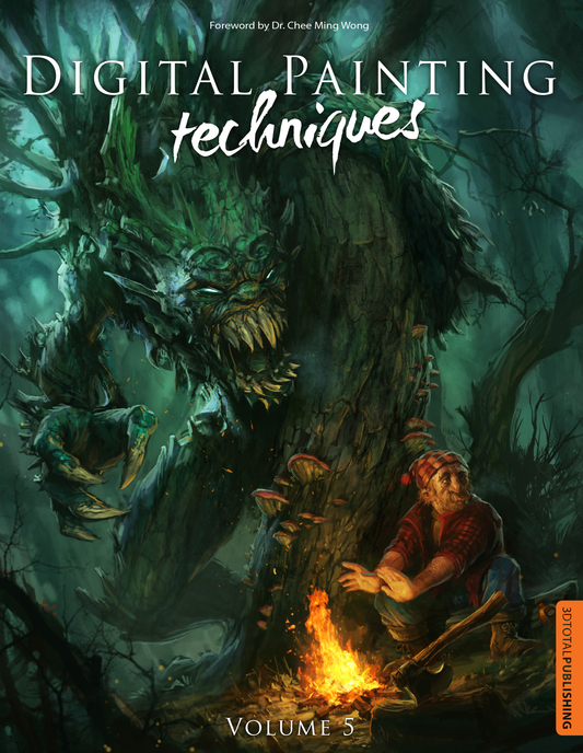
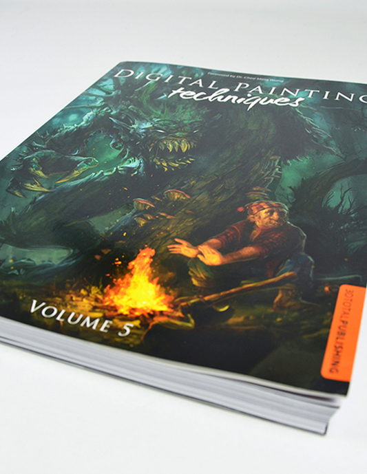
Digital Painting Techniques: Volume 5 (Downloadable Edition)
Regular price Free!Regular priceUnit price per -
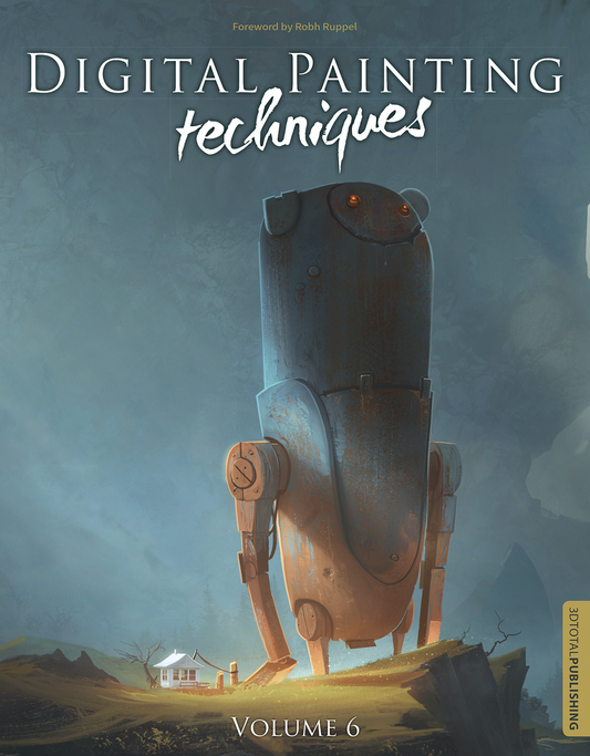
Digital Painting Techniques: Volume 6 (Downloadable Edition)
Regular price Free!Regular priceUnit price per -
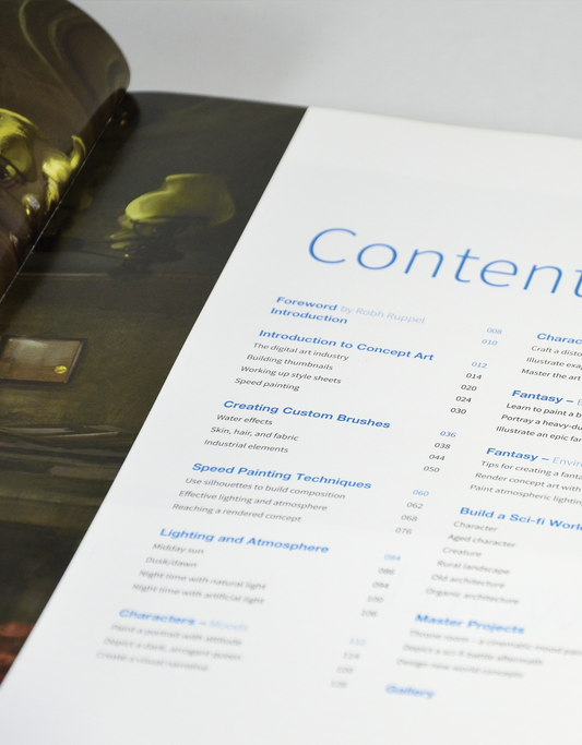
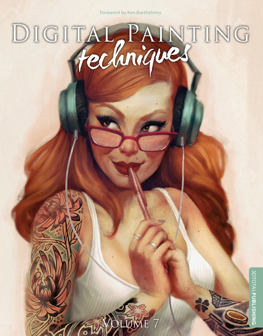
Digital Painting Techniques: Volume 7 (Downloadable Edition)
Regular price Free!Regular priceUnit price per -
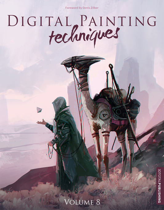
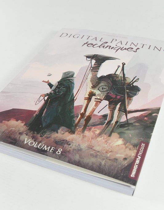
Digital Painting Techniques: Volume 8 (Downloadable Edition)
Regular price Free!Regular priceUnit price per£0.00 GBPSale price Free! -
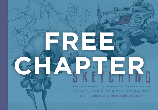
FREE CHAPTER - Beginner's Guide to Sketching: Robots, Vehicles & Sci-fi Concepts (Download Only)
Regular price Free!Regular priceUnit price per -
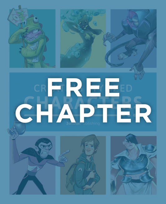
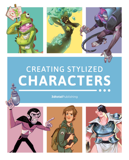
FREE CHAPTER - Creating Stylized Characters (Download Only)
Regular price Free!Regular priceUnit price per -
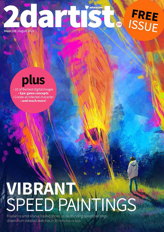
FREE ISSUE - 2DArtist: Issue 116 - August 2015 (Download Only)
Regular price Free!Regular priceUnit price per -
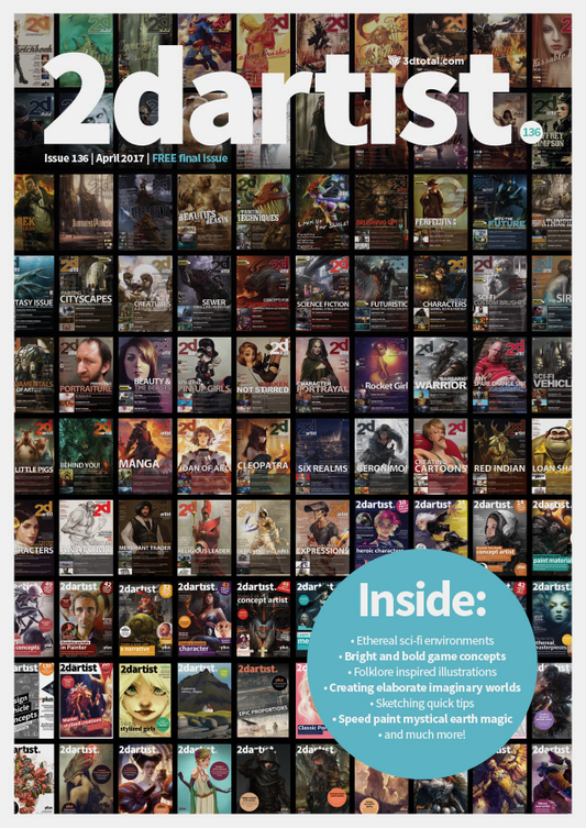
FREE ISSUE - 2DArtist: Issue 136 - April 2017 (Download Only)
Regular price Free!Regular priceUnit price per -
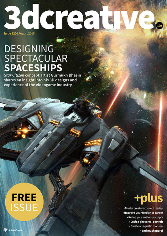
FREE ISSUE - 3DCreative: Issue 120 - August 2015 (Download Only)
Regular price Free!Regular priceUnit price per -
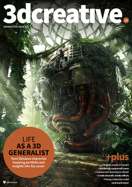
FREE ISSUE - 3DCreative: Issue 125 - January 2016 (Download Only)
Regular price Free!Regular priceUnit price per -
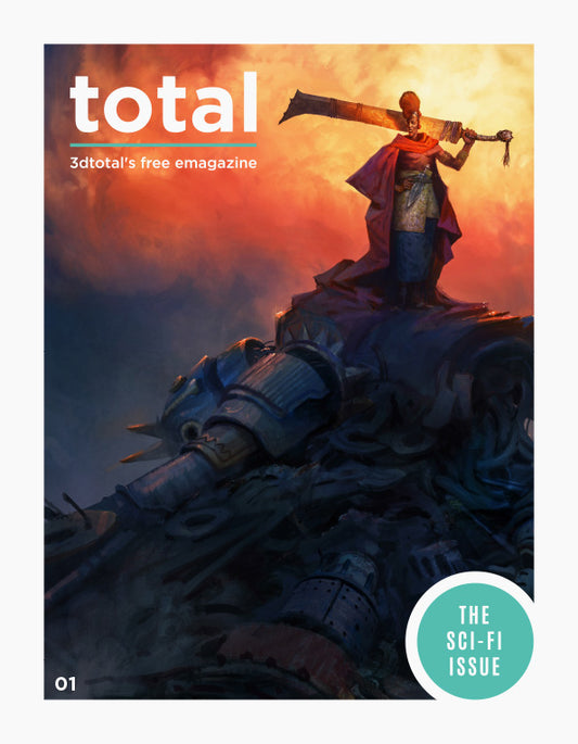
FREE MAGAZINE - Total Issue 01 (Download Only)
Regular price Free!Regular priceUnit price per -
FREE MAGAZINE - Total Issue 02 (Download Only)
Regular price Free!Regular priceUnit price per -
FREE MAGAZINE - Total Issue 03 (Download Only)
Regular price Free!Regular priceUnit price per -
FREE MAGAZINE - Total Issue 04 (Download Only)
Regular price Free!Regular priceUnit price per -
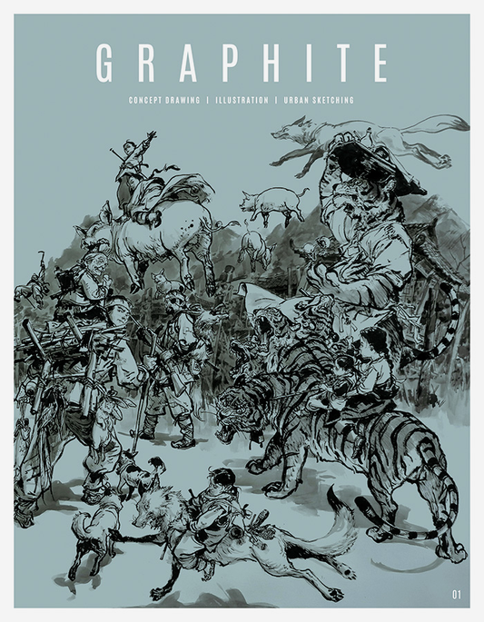
GRAPHITE Issue 01 (Downloadable Edition)
Regular price Free!Regular priceUnit price per -
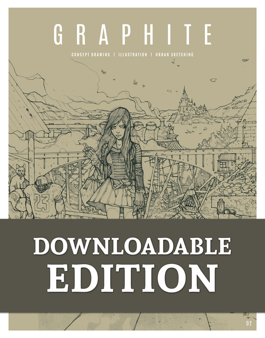
GRAPHITE issue 02 (Downloadable Edition)
Regular price Free!Regular priceUnit price per -
GRAPHITE Issue 03 (Downloadable Edition)
Regular price Free!Regular priceUnit price per -
GRAPHITE Issue 04 (Downloadable Edition)
Regular price Free!Regular priceUnit price per -
GRAPHITE Issue 05 (Downloadable Edition)
Regular price Free!Regular priceUnit price per -
GRAPHITE Issue 06 (Downloadable Edition)
Regular price Free!Regular priceUnit price per -
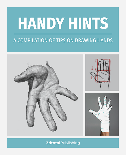
Handy hints: a compilation of tips on drawing hands (Download Only)
Regular price Free!Regular priceUnit price per -
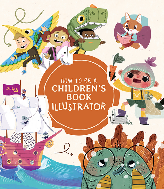
How to Be a Children’s Book Illustrator - SAMPLE (Download Only)
Regular price Free!Regular priceUnit price per -
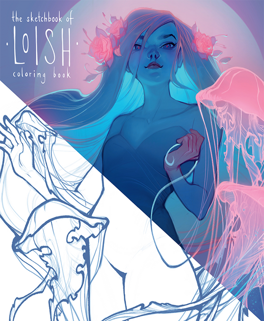
Loish - Coloring Book (Download Only)
Regular price Free!Regular priceUnit price per -
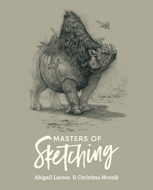
Masters of Sketching: Abigail Larson & Christina Mrozik (Download Only)
Regular price Free!Regular priceUnit price per -
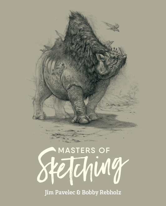
Masters of Sketching: Jim Pavelec & Bobby Rebholz (Download Only)
Regular price Free!Regular priceUnit price per -
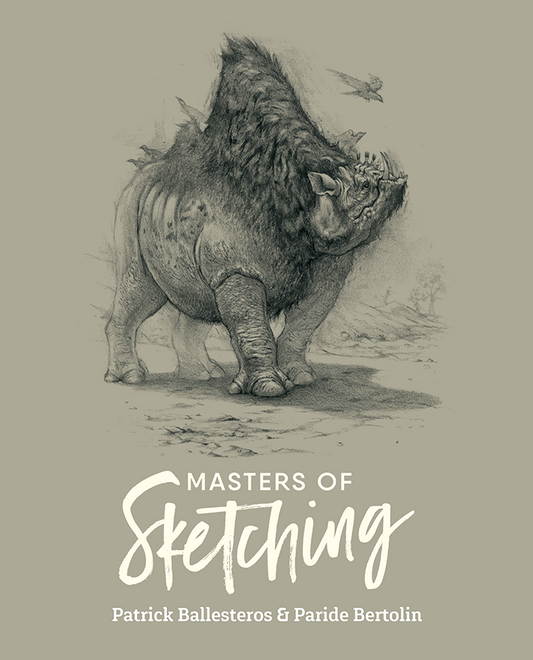
Masters of Sketching: Patrick Ballesteros & Paride Bertolin (Download Only)
Regular price Free!Regular priceUnit price per -
Sketch Workshop: Anatomy (Downloadable Edition)
Regular price Free!Regular priceUnit price per£0.00 GBPSale price Free! -
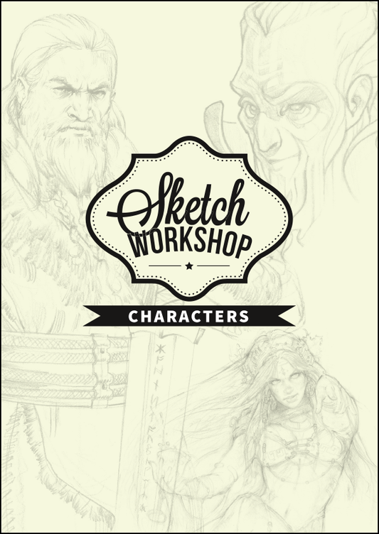
Sketch Workshop: Characters (Downloadable Edition)
Regular price Free!Regular priceUnit price per£0.00 GBPSale price Free! -
Sketch Workshop: Cityscapes (Downloadable Edition)
Regular price Free!Regular priceUnit price per -
Sketch Workshop: Creatures (Downloadable Edition)
Regular price Free!Regular priceUnit price per -
Sketch Workshop: Landscapes (Downloadable Edition)
Regular price Free!Regular priceUnit price per£0.00 GBPSale price Free! -
Sketch Workshop: Robots & Spaceships (Downloadable Edition)
Regular price Free!Regular priceUnit price per£0.00 GBPSale price Free!