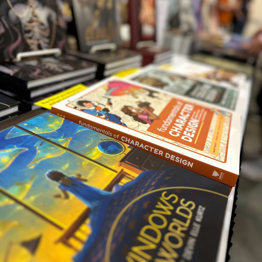
Blogs and News
-
News
Latest News -
Interviews
Latest Interviews -
Latest Charity News
Charity
Blog posts
-
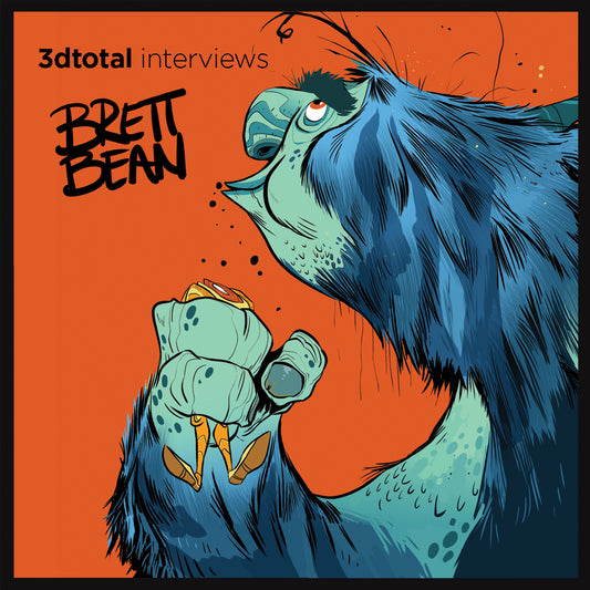
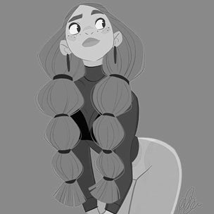
An Interview with Brett Bean
His name is Brett Bean and he likes long walks on the beach as well as drawing! Neddy had a thoroughly enjoyable chat with the always jovial Brett Bean about his...
-
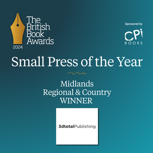
We won an award!
We are honoured to have been recognised by The Booksellers as the Midlands Regional and Country Winner!
-
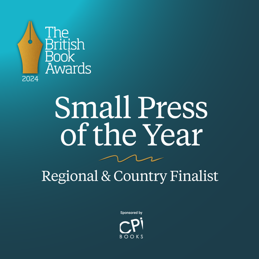
We are up for an award!
We are thrilled to announce that we have been selected by The Bookseller as a Regional & Country Finalist for Small Press of the Year in the Midlands.
-
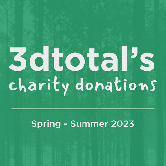
Charity Update Spring- Summer 2023
Between March 2023 and August 2023, we have donated to the following causes: £46,316 to Giving What We Can £19,850 to Founders Pledge Climate Change Fund £11,454 to Eden Reforestation £7,800 to Worcester Environmental £6,616 to GiveDirectly £1,800 to HCC Children's...
-
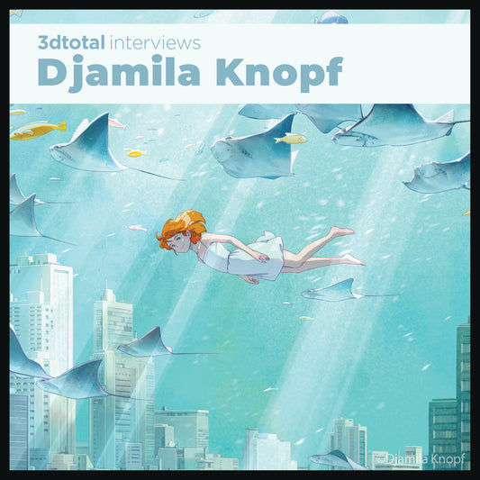
An interview with Djamila Knopf
Djamila chats about her newest artbook with 3dtotal Luminescence: Shedding light on the creative process with Djamila Knopf.
-
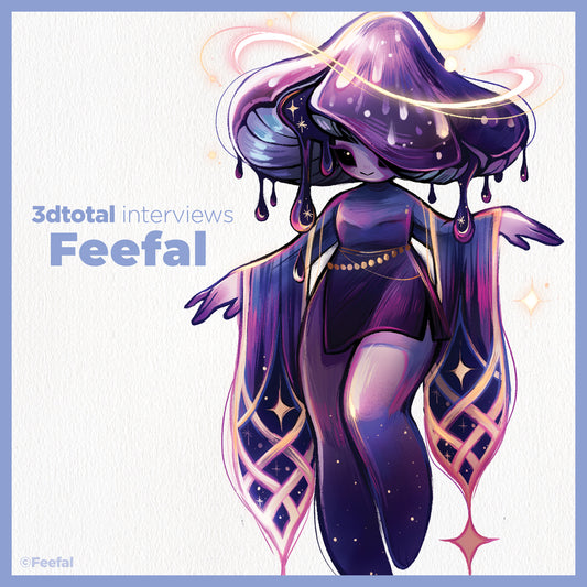
An Interview with Linnea Kikuchi (AKA Feefal)
Feefal chats about her latest collaboration with 3dtotal on Inspired by Nature: A guide to designing botanical characters.
-
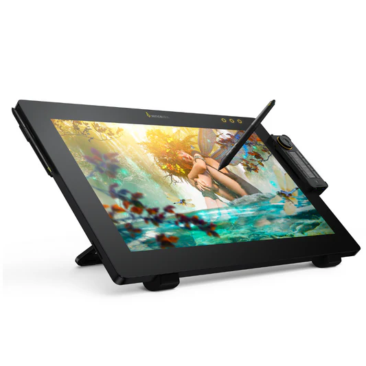
3dtotal reviews the fantastic Xencelabs Pen Dis...
We reviewed the Xencelabs Pen Display 24 and think it's the most artist-friendly pen display on the market.
-
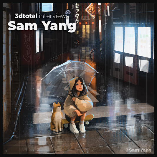
An Interview with Sam Yang
Digital artist Sam Yang talks to 3dtotal interviewer Neddy about his classical art upbringing, how he transferred his skill to create a more stylised approach, and how he broke into social media.
-
Lightbox 2023
What a blast we had at Lightbox 2023! We reunited with some old friends and met some new ones. We’re looking forward to next year already!
-
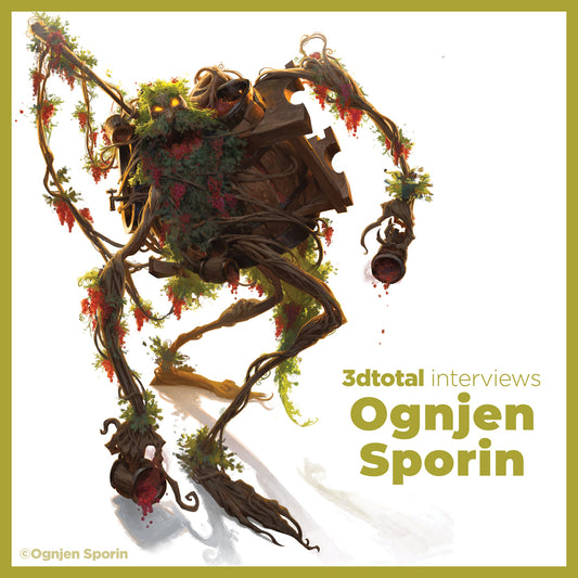
An Interview with Ognjen Sporin
Illustrator Ognjen Sporin talks to 3dtotal interviewer Neddy about becoming professional so young, where he sees his artistic journey taking him, and his love for the nostalgia of books.
-
-
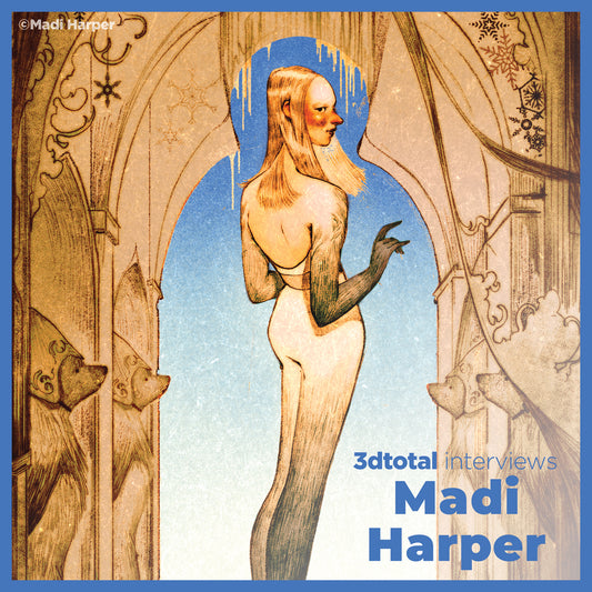
An Interview with Madi Harper
Illustrator Madi Harper talks to 3dtotal interviewer Neddy about her artistic journey, faith and inspirations.
-
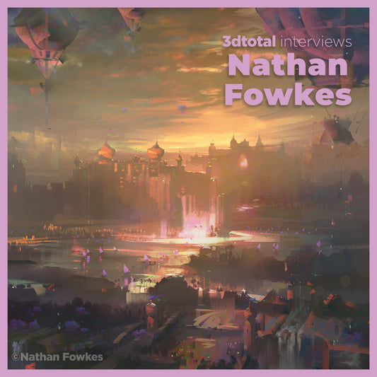
Audio interview with Nathan Fowkes
3dtotal interviews Nathan Fowkes, contributor to the Artists' Master Series books: Color and Light and Composition and Narrative. Listen now!
-
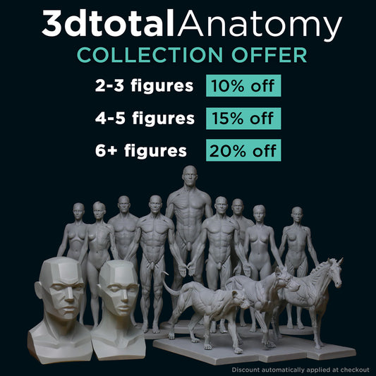
New Anatomy Figure offer!
Our Anatomy Figure offer has received a refresh, with double the discount available! Now get 10% off when you buy 2-3 figures, 15% off when you get 4-5 figures and...
-
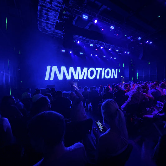
3dtotal at Playgrounds London
3dtotal Managing Director Tom Greenway, Studio Manager Simon Morse, and Marketing Manager Nicole Jones popped down to London for the day on Friday 8 September 2023, to join the fun...
-
3dtotal is undergoing a refresh
Times and the way the internet is used have changed, and social media has rapidly developed into the primary channel for emerging artists. We have therefore made the difficult decision...
-
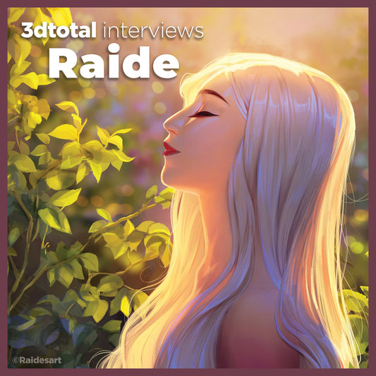
Video interview with Raidesart
3dtotal interviewer, Neddy, sat down to chat with Raidesart, to talk about her artistic journey so far, from getting rejected from art school the first time around to her new art book,...
-
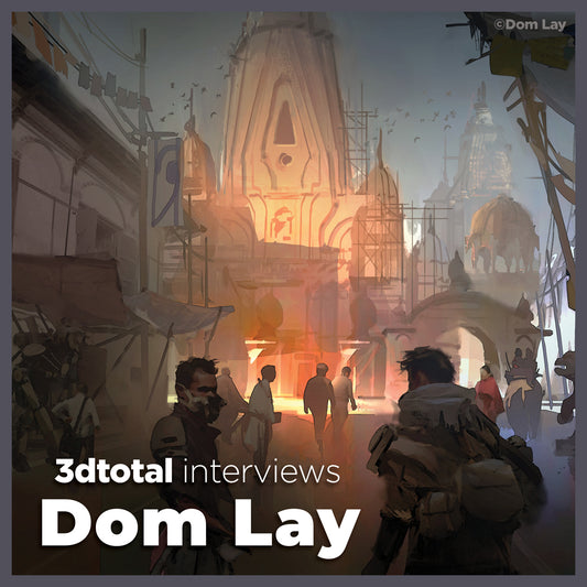
Video interview with Dom Lay
3dtotal interviews Dom Lay, contributor to Artists' Master Series: Composition and Narrative. Watch now!
-
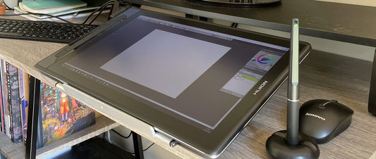
Huion Kamvas 16 Pro (2.5k)
In this review I’ll take a look at the new Huion pen display tablet, the Huion 16 Pro. I’ll try to consider everything from the perspective of a potential customer....
-
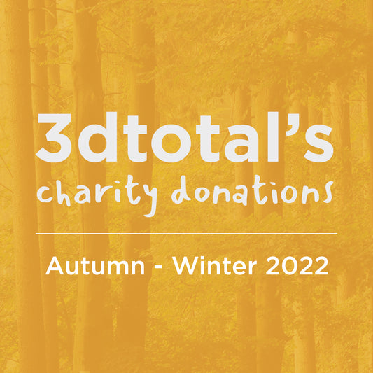
Charity Update Autumn - Winter 2022
3dtotal has committed to donating 50% of our net profits to charitable causes, and we wanted to share what our success has allowed us to donate from September 2022 - February 2023.
-
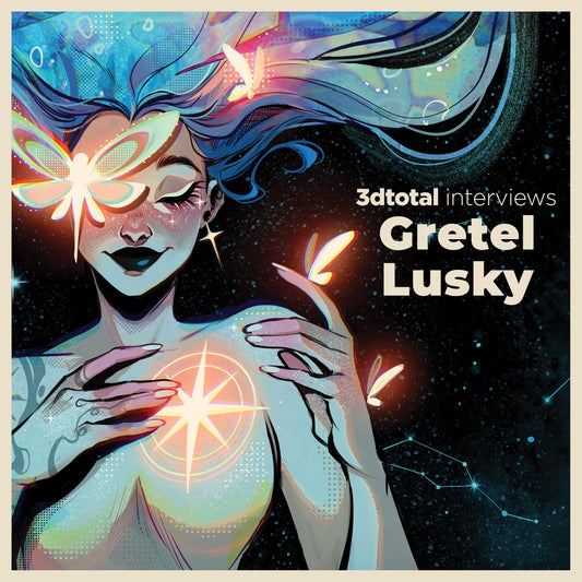
An Interview with Gretel Lusky
Gretel Lusky is an illustrator and comic book artist based in Argentina. She illustrated her very first graphic novel Primer for DC Comics and worked on DC’s Flash Facts and...
-
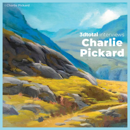
An interview with Charlie Pickard
We sat down to chat with Charlie Pickard about his important, introductory content in the hugely popular and highly rated Artists' Master Series: Color and Light. Find out his thoughts on...
-
Charity Update Spring - Summer 2022
3dtotal has committed to donating 50% of our net profits to charitable causes, and we wanted to share what our success has allowed us to donate from March - August 2022.
-
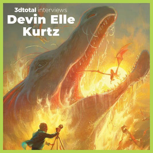
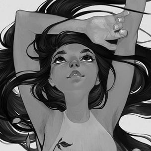
Another interview with Devin Elle Kurtz
We sat down to chat with long-time contributor Devin Elle Kurtz, touching on her artistic journey from a young age to a hit Netflix show, helpful tips to all artists,...
-
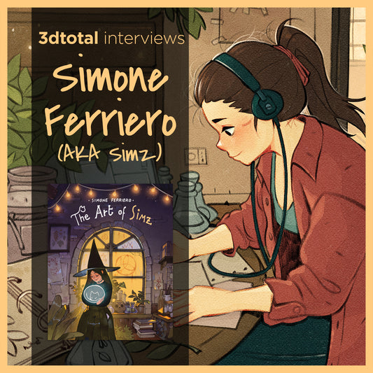
An interview with Simz
Simone “Simz” Ferriero is a freelance comic-book artist and illustrator from Italy. His modern-day witches and ghost cats have earned him a big online fanbase, with 343K followers on Instagram...
-
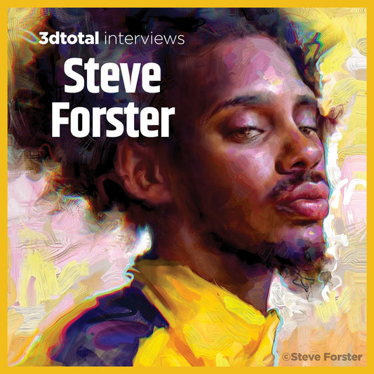
An Interview with Steve Forster
We sat down to chat to Steve Forster, whose gorgeous artwork can be seen in Beginners Guide to Creating Portraits.
-
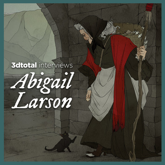
An Interview with Abigail Larson
We sat down to chat to long-time contributor Abigail Larson, who is the cover artist for The Field Guide to Witches, about her creative journey and inspiration.
-
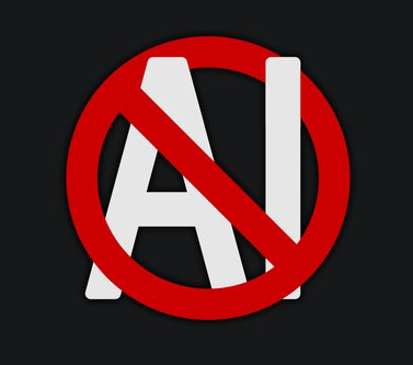
3dtotal's statement about AI art
If you’re a digital art enthusiast, social media user, or artist yourself, you will have inevitably come across the debate regarding AI art. Below is a statement from 3dtotal regarding...
-
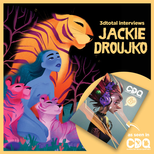
VODCAST: An Interview with Jackie Droujko
We sat down to chat to artist Jackie Droujko, who features in Character Design Quarterly issue 22, about her career and any tips she has for budding artists and illustrators.
-
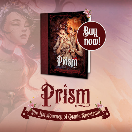
VODCAST: An interview with Cosmic Spectrum
In this interview with 3dtotal, Cosmic Spectrum talks about her book Prism: The Art Journey of Cosmic Spectrum, discussing what was the inspiration behind the name and beautiful cover art...
-
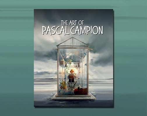
VODCAST: An interview with Pascal Campion
In this interview, Pascal takes us through his professional journey, trademark style, and techniques, plus tells us what we can find in his artbook, The Art of Pascal Campion.
-
Charity Update Autumn - Winter 2021
3dtotal has committed to donating 50% of our net profits to charitable causes, and we wanted to share what our success has allowed us to donate from September 2021 - February 2022.
-
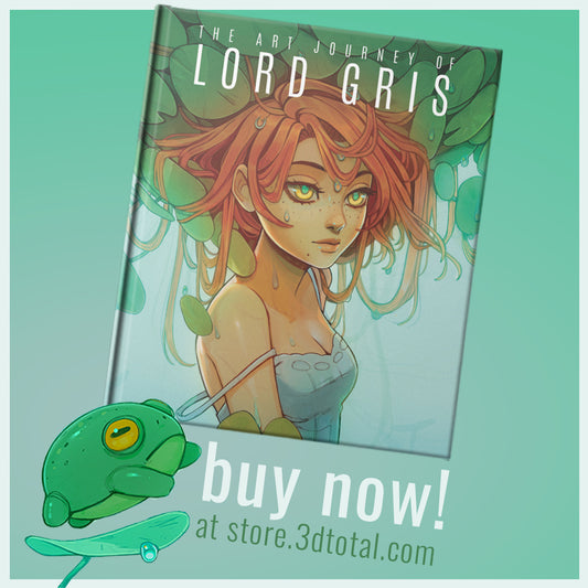
VODCAST: Lord Gris-Buy Now!
Lord Gris talks about her difficult and unconventional journey to becoming the artist she is today, offers advice to her younger self and others just like her, plus tells us...
-
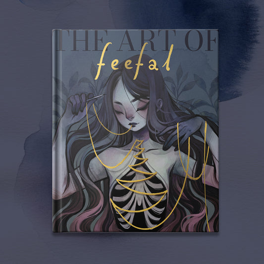
VODCAST: An interview with Feefal
With the release of Feefal's Kickstarter-funded book, The Art of Feefal, we sat down to chat about her unique style, finding a community online, and whether or not you should...
-
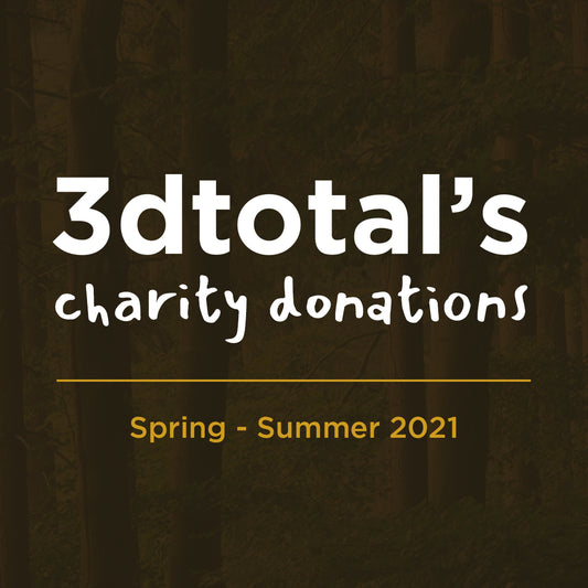
Charity Update Spring - Summer 2021
3dtotal has committed to donating 50% of our net profits to charitable causes, and we wanted to share what our success has allowed us to donate from March - August 2021.
-
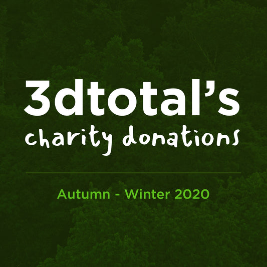
Charity Update Autumn - Winter 2020
3dtotal has committed to donating 50% of our net profits to charitable causes, and we wanted to share what our success has allowed us to donate from September 2020 - February 2021.
-
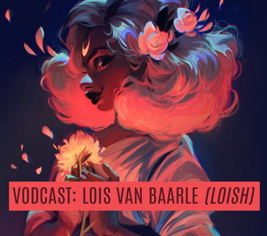
VODCAST: An interview with Lois van Baarle (LO...
With the release of 3dtotal and Lois van Baarle's newest Kickstarter-funded book The Style of Loish: Finding An Artistic Voice, illustrator and character designer Loish chats with us about how The Style...
-
VODCAST: An interview with The Shiflett Brothers
In 3dtotal's latest vodcast, Paul Hellard chats with the fantasy clay sculpting masters and visionaries of their craft, the Shiflett Brothers...
-
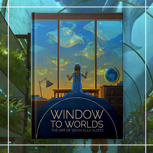
VODCAST: An interview with artist Devin Elle Kurtz
We chat with Californian digital artist and good friend of 3dtotal, Devin Elle Kurtz about her art, and her new book, Windows to Worlds.
-
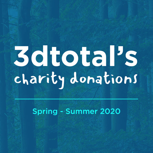
Charity Update Spring - Summer 2020
3dtotal has committed to donating 50% of our net profits to charitable causes, and we wanted to share what our success has allowed us to donate from March - August 2020.
-
Earth Draw III
At 3dtotal, our mission is to help our readers grow in knowledge and skill; we are also committed to trying to help the planet and the people who inhabit it....
-
Charity Update Winter 2019
From 2020, 3dtotal has committed to donating 20% of our net profits to charitable causes, to help the world and the people who inhabit it, this is thanks to the...
-
Charity Update 2012 - 2019
In 2012, 3dtotal began to experiment with charitable giving. At the time of writing (October 2020) we have expanded our charitable giving considerably and this is thanks to our amazing customers,...
-
PODCAST: Max Ulichney interview
In this podcast we talk to creator Max Ulichney, contributor to Beginner’s Guide to Digital Painting in Procreate, who talks about his career so far…
-
PODCAST: An interview with illustrator Beatrice...
Illustrator Beatrice Blue has worked with some big-name companies like Dreamworks TV, Nickelodeon, and Square Enix Montreal, and has recently published her Kickstarted artbook Wonder. We catch up with her...
-
PODCAST: An interview with schmoedraws
Check out latest 3dtotal podcast, featuring Simone Grünewald aka Schmoedraws talking about her art of book Sketch Every Day and life as an artist...
-
PODCAST: An interview with Heikala
The fabulous Heikala takes time out of her busy schedule to chat about her art and influences, and working with 3dtotal on her Art of Heikala book...
-
Nathan Fowkes: Art Side of Life Interview
Art Side of Life chats to Nathan Fowkes, a veteran artist with credits on 11 films including Prince of Egypt, Spirit, projects within the Shrek Universe, How to Train Your...
-
Pernille Ørum: Art Side of Life Interview
Art Side of Life chats to Pernille Ørum, a freelance illustrator and character designer from Denmark. Her clients include Disney, Warner Bros, Mattel, and Nickelodeon. She was the lead character...
-
Loish: Art Side of Life Interview
Art Side of Life chats to Loish about the past year, conquering her fear of doing workshops, and how much she enjoys it now!


